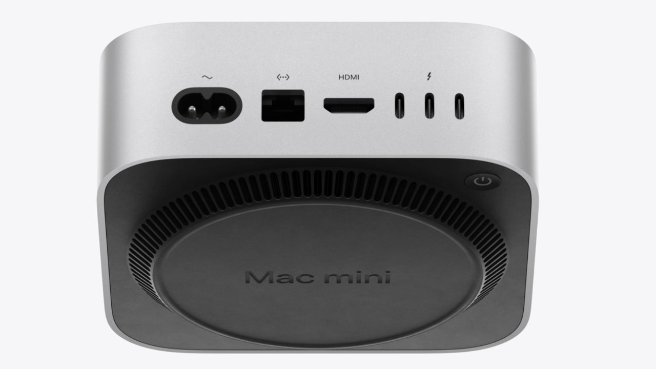
Apple's latest Mac mini redesign, featuring the cutting-edge M4 chip, boasts a significantly smaller profile than previous models, marking a shift toward even more streamlined aesthetics. However, a surprising change has caught the attention of tech enthusiasts: the relocation of the power button to the bottom of the device. Greg Joswiak, Apple’s Senior Vice President of Worldwide Marketing, and John Ternus, the company’s Senior Vice President of Hardware Engineering, recently provided insights into this design choice.
According to the executives, the button placement was a carefully considered compromise aimed at maximizing internal space without reducing the number of ports—a critical feature for users who require multiple connections. “The new design was a challenge,” said Ternus, “but relocating the power button to the bottom allowed us to retain all the connectivity options our users expect.”
While Apple expressed confidence that the new layout will be convenient for most users, who generally rely on sleep mode rather than powering off, some users have expressed concerns. The power button’s location could make full shutdowns or restarts slightly cumbersome, especially if the Mac mini is tucked away in a hard-to-reach spot on a desk. Online communities and forums have since lit up with discussions on potential workarounds or even DIY modifications to bring the button back to a more accessible spot.
Despite the feedback, Apple maintains that the button’s new placement is a minor inconvenience outweighed by the benefits of preserving port access and reducing the overall device size. Apple’s focus on maintaining functionality within a minimized form reflects the company’s ongoing commitment to balancing design with user experience.
 News
News
 Games
Games
 Software
 Music
Music
 Technology
 Hardware
 eSports
 AI-Artificial Intelligence
 Internet
